Semester Reflection: What did you learn? What was your favorite and least favorite projects? Any suggestions for improvement?
In this class, I learned computer shortcuts and became familiar with Adobe Illustrator, Photoshop, and In Design. I learned that this class was really time consuming as well. I did not really have a favorite project, but if I had to choose I would say my favorite project was the book cover design, while my least favorite project was blogging. Some of my friends took this class last year and recommended that I take it because they said it was fun to create your own stickers. So, thinking that this class was fun I signed up for it and found out that this year was different. We were not going to make stickers, but we were going to blog, sketch, and do a lot of projects on the computers. When I found out that I was not able to make stickers, I was very disappointed because I originally signed up for that and I really wanted to make stickers for my new laptop. So to improve this class, it would be best to limit the assignments on our blogs, have extra credit opportunities, and make the sketchbook optional; like whoever does the sketchbook could earn extra credit.
Tuesday, January 6, 2015
Post #17
Identify 5 colleges that offer graphic design (or related) majors. For each, list the school name, location, graphic majors that are offered and requirements for admission.
The Art Institute 2900 31st Street Computer Animation Application essay & fee
of California- Santa Monica Media Arts & Animation Interview
Santa Monica California, 90405 Visual Effects & High school transcript
Motion Graphics Portfolio
Graphic Design
California Institute 24700 McBean Graphic Design Letters of Recommendation
Merchandising- 90015 (Branding or Entertainment) 3 Letters of
Also, answer the following questions in your own words.
What is a portfolio?
A portfolio is a folder of your artwork and paperwork
School: Location: Graphic Majors: Admission Requirements:
The Art Institute 2900 31st Street Computer Animation Application essay & fee
of California- Santa Monica Media Arts & Animation Interview
Santa Monica California, 90405 Visual Effects & High school transcript
Motion Graphics Portfolio
Graphic Design
California Institute 24700 McBean Graphic Design Letters of Recommendation
of the Arts Parkway, Valencia, Character Animation Portfolio
CA, 91355 Art and Technology High school transcript
Artist Statement
California State 800 North State Entertainment Art/ SAT or ACT subject tests
University- College Boulevard Animation Online Application + fee
Fullerton Fullerton, CA, 92831 Illustration
Graphic Design
California State 1250 Bellflower Blvd Graphic Design SAT or ACT subject tests
University- Long Beach, CA, Studio Art Online Application + fee
Long Beach 90840 Illustration/Animation Track
Fashion Institute 919 South Grand Ave. Digital Media Application essay
of Design & Los Angeles, CA, Graphic Design High School transcriptMerchandising- 90015 (Branding or Entertainment) 3 Letters of
Los Angeles Recommendation
Portfolio
Also, answer the following questions in your own words.
What is a portfolio?
A portfolio is a folder of your artwork and paperwork
What is the importance of a portfolio?
Portfolios make you unique because it has all your work and colleges look at them to consider you for their school.
Portfolios make you unique because it has all your work and colleges look at them to consider you for their school.
Post #16
How many points are in an inch? 72
How many points are in a pica? 12
Of the seven classifications, which classification(s) would best work as body type? Why? The Sans-Serif would work best as body type because this typeface is very popular throughout this century and easy to read.
Identify the lowercase characters that have ascenders? b, d, f, h, i, j, k, l
Identify the lowercase characters that have descenders? g, j, p, q, y
Classify the following typefaces and briefly explain why you believe it should be classified that way:

This typeface would be classified as a historical typeface because the font is kind of like the Blackletter font and that was used in the old centuries. So I believe that this font falls under the history category.

This typeface would be classified as a romantic typeface because it has loops and swashes and looks like cursive as well. This typeface is usually found in romantic books, movies, posters, or other types of social media.

I would classify this typeface as a modern typeface because it looks like the Times New Roman font or Serif font and I think mostly everyone recognizes it. Teachers would usually ask their students to use this typeface for their research papers.
 |
This typeface reminds me of the Cambria font because it's simple yet easy to read. I would normally find this font in a New York Times magazine and in the 20th century.
Post #15
Video #4 Typography:
Define typography?
Typography is the style and appearance of printed matter.
What is the difference between font and a typeface?
Font is a particular size, weight and style of a typeface while a typeface is a set of one or more fonts each composed of glyphs that share common design features.
What is the waist line and what does it indicate? What is a base line and what does it indicate?
The invisible or imaginary horizontal rule that indicates the top of the body height of the lowercase letters (aka x height). A baseline is the line upon which most letters "sit" and below which descenders extend.
What is counter?
A counter is a negative space within a character that may be fully or partially enclosed.
What is cap height?
Refers to the height of a capital letter above the baseline for a particular typeface.
What is x height?
refers to the distance between the baseline and the mean line of lower-case letters in a typeface.
What is an ascender?
the part of a lowercase letter that rises above x-height.
What is a descender?
part of a lowercase letter that extends below the main body of the letter
Describe a serif? the little extra stroke found at the end of main vertical and horizontal strokes of some letterforms.
What is leading? Spacing between lines
What is tracking? adjustment of space for groups of letters and entire blocks of text
What is kerning?
Typesetting technique that overlaps the edges of two type characters to provide the illusion of even spacing
What is a point? How many points are in an inch?
A unit of measurement, often used to measure type size. There are 72 points in an inch.
What is a pica and how many are in an inch? Type setting unit of measure and there are 6 picas in an inch.
How many points are in a pica? 12
When was Blackletter invented and how was it used? In the 12th century and it was used for writing
Describe the characteristics of a Blackletter typeface? Thick vertical lines and thin horizontal connectors.
When was Old Style invented and what was is based on?
In the 18th century and based on a new standard of writing.
Describe the characteristics of an Old Style typeface? letters with thick serifs
When were formal scripts developed? 17/18th century
When were casual scripts developed? Early 1950's
Describe the characteristics of a Script typeface?
Formal writing like cursive, with looser casual scripts.
When was Modern typefaces developed and why?
The late 18th century because people wanted something new.
Describe the characteristics of a Modern typeface? extreme contrast between thick and thin lines
How early can Sans Serif typefaces be found? What happened?
5th century BC, but the writing styles kept changing.
When did they become popular? 20th century
What does "sans serif" mean? "Without"
Describe the characteristics of a Sans Serif typeface?
A font without serifs at the end of a stroke.
When was Slab Serif developed and why?
Around the 2nd Industrial Revolution because people wanted new types of writing.
Describe the characteristics of a Slab Serif typeface? thick serifs, used for titles.
Describe Decorative typefaces?
Fonts are typically used for titles, headlines, and for small amounts of text in large sizes
Post #14
Who is Stephen Kroninger? He is a writer, artist, and illustrator for the New York Times.
What kind of art/design does he produce?
His artwork contains pictures of famous and non-famous people in illustration.
In what publications/media studios has his work been featured? In the National Portrait Gallery of the Smithsonian Institute and the New York Times Magazine.
Post 2 samples of his art. Answer the following questions for each piece...

Was this piece published? Where? This piece was published in a children's book that he wrote.
What principles of design were utilized within the piece? How? C.R.A.P. was demonstrated in this artwork because he used all of the elements. The colors to describe contrast, the same size, color, and shape of some objects, how the table and chair is aligned, and how the picture is unique and cute for children to read.
What elements of design were utilized? All the elements of design were used.

Was this piece published? Where? It was published in the New York Times magazine.
What principles of design were utilized within the piece? How? All the principles of design were used. The colors showed contrast, the man's head that showed repetition and alignment, and the proximity of items around him were grouped.
What elements of design were utilized? All the elements of design were used.
What kind of art/design does he produce?
His artwork contains pictures of famous and non-famous people in illustration.
In what publications/media studios has his work been featured? In the National Portrait Gallery of the Smithsonian Institute and the New York Times Magazine.
Post 2 samples of his art. Answer the following questions for each piece...
Was this piece published? Where? This piece was published in a children's book that he wrote.
What principles of design were utilized within the piece? How? C.R.A.P. was demonstrated in this artwork because he used all of the elements. The colors to describe contrast, the same size, color, and shape of some objects, how the table and chair is aligned, and how the picture is unique and cute for children to read.
What elements of design were utilized? All the elements of design were used.
Was this piece published? Where? It was published in the New York Times magazine.
What principles of design were utilized within the piece? How? All the principles of design were used. The colors showed contrast, the man's head that showed repetition and alignment, and the proximity of items around him were grouped.
What elements of design were utilized? All the elements of design were used.
Post #13
How can you as the designer use principles of design to help compose a page?
What are the principles of design (define each in your own words)?

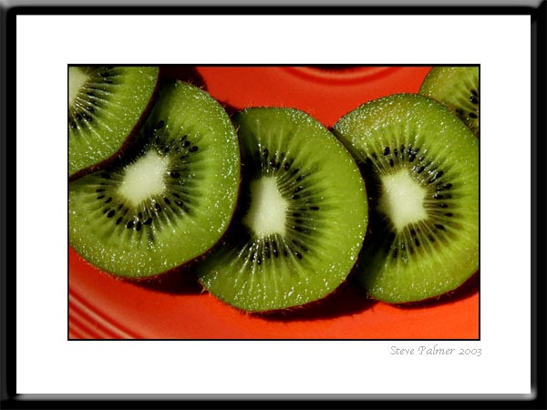
This picture shows how the principles of design is used. The green kiwis are the big picture in the artwork and they are sitting on top of a red plate, showing contrast. The kiwis show repetition because they are the same size and color. The kiwis are evenly cut and are aligned perfectly on the red plate. The proximity is that all the kiwis are grouped together and this picture demonstrates that.
Also, answer the following questions in your own words.
How do you add a layer mask to a particular layer?
What two colors are used to create the mask?
Describe the process of using a layer mask?
I can use principles of design to make my work stand out from everyone else's.
What are the principles of design (define each in your own words)?
The principles of design are using the elements of art in one's own artwork to make their artwork unique. Examples are balance, contrast, emphasis, movement, pattern, rhythm, and unity.
Balance- objects that are placed equally in an artwork
Contrast- the color scheme(s) in an artwork.
Emphasis- creating artwork that show the big picture
Movement- the space or proximity in a work of art.
Pattern- color, size, and shapes in a artwork
Rhythm- repeating ideas in a work of art
Unity- same shapes and texture in a work of art.
For each of the 4 principles of C.R.A.P., find an example that utilizes the principle within the design. You should have 4 DIFFERENT sample designs. For each, discuss how the particular principle is used.

In this artwork, C.R.A.P. is demonstrated. The contrast is how the color scheme is used, how Mickey Mouse is in black and the other colors around him make him stand out. The repetition is that Mickey Mouse is used four times in this artwork. Mickey Mouse is aligned equally in his four different squares. Mickey Mouse is used four times to show proximity and that this artwork represent pop art.
The principles of design is represented by this artwork because the contrast is the orange and red color used that gives this picture warmth. The squares on the right side of the picture are aligned equally with the same pattern and color, demonstrating repetition. The squares are aligned perfectly, showing alignment. The proximity is how the squares contain space between them throughout the image.
Balance- objects that are placed equally in an artwork
Contrast- the color scheme(s) in an artwork.
Emphasis- creating artwork that show the big picture
Movement- the space or proximity in a work of art.
Pattern- color, size, and shapes in a artwork
Rhythm- repeating ideas in a work of art
Unity- same shapes and texture in a work of art.
For each of the 4 principles of C.R.A.P., find an example that utilizes the principle within the design. You should have 4 DIFFERENT sample designs. For each, discuss how the particular principle is used.

In this artwork, C.R.A.P. is demonstrated. The contrast is how the color scheme is used, how Mickey Mouse is in black and the other colors around him make him stand out. The repetition is that Mickey Mouse is used four times in this artwork. Mickey Mouse is aligned equally in his four different squares. Mickey Mouse is used four times to show proximity and that this artwork represent pop art.
 |
The creator of this movie poster showed the principle of design. The contrast is the color scheme of this poster- black and blue how it's used evenly throughout the artwork. The A's in the title- Avatar demonstrates repetition because the A's are the same color, same size, and same font. The words show center alignment. The proximity is how the picture of the alien, color scheme, and words used within the poster.
 |
Also, answer the following questions in your own words.
How do you add a layer mask to a particular layer?
You add a layer mask to a layer by clicking on the add a layer mask button in the palette and you can pick the colors and pictures.
What two colors are used to create the mask?
The 2 colors must be monochromatic colors like on a grayscale.
Describe the process of using a layer mask?
By using a layer mask, it makes it easier for you and saves a lot of time. It will help you create transparency on a layer without erasing everything else on that layer.
Subscribe to:
Comments (Atom)